
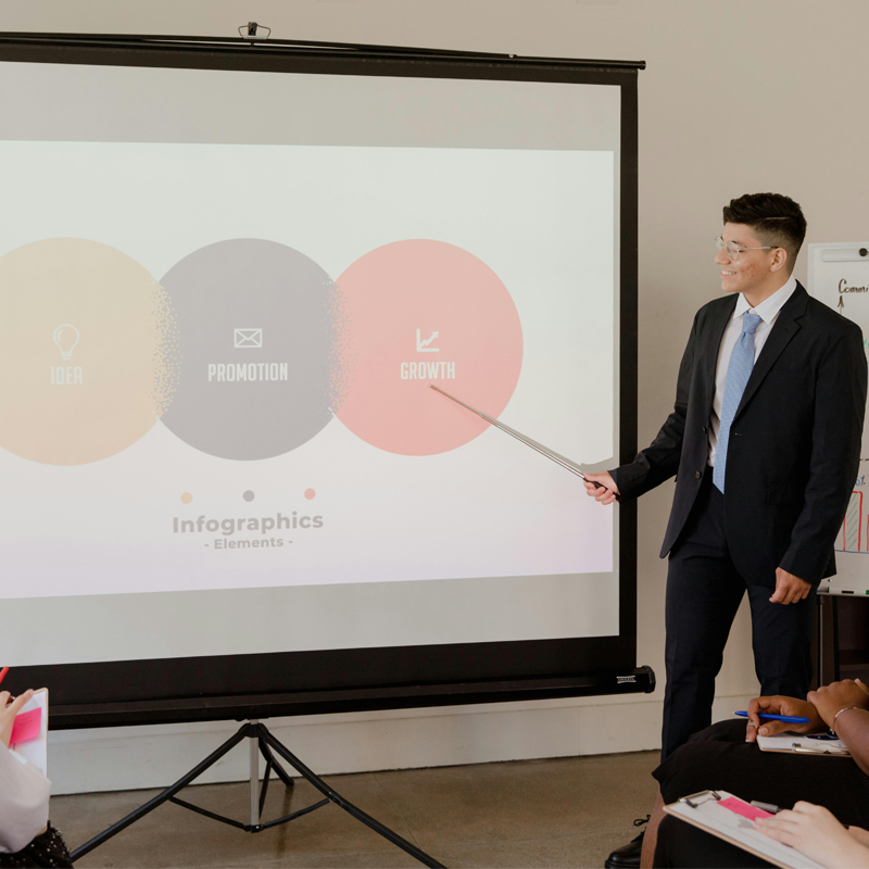

Imagine this: You’re seated in a dimly lit room, eyes glazed over, silently pleading for mercy. The screen in front of you is filled with microscopic text, clashing colors, and a graph so chaotic it might as well be a Jackson Pollock painting.
You came to hear a talk… but instead, you’re in a battle for your retinas.
Sounds familiar?
We’ve all been there. The content might be gold, the speaker brilliant—but when the visuals assault instead of assist, even the best presentations collapse under the weight of bad design.
That’s the tragedy: The message gets lost not because it’s wrong, but because it’s buried in visual noise.
Thankfully, there’s the good news: It doesn’t have to stay that way!
Your visuals should be your secret weapon—a well-dressed accomplice that enhances your message, captivates your audience, and keeps them locked in from slide one to mic drop.
Welcome to the golden rule of presentation design: Visuals should be eye-candy, not eye-strain.
More Than Just Visuals or Decoration
Visuals are not there to decorate your slides like ornaments on a tree. They are there to clarify, emphasize, and amplify your message.
In other words, great visuals do the heavy lifting—cutting through complexity, evoking emotion, and helping your audience remember key points long after the room empties.
Besides, think about this: In writing, we are taught that good communication isn’t just about what you say but also about how you structure and present it.
The same is true for your slides. Clarity is kindness, and that kindness starts with making your visuals easy to digest.
However, let’s clear something up first: “Eye-candy” doesn’t mean glitter, gimmicks, or gratuitous animations that make your audience feel like they’re watching a PowerPoint rave.
True eye-candy is about:
- Clean design – Ample white space, readable fonts, and harmonious colors.
- Simplicity – One big idea per slide. No clutter. No walls of text.
- Consistency – Fonts, colors, and visual styles that follow a rhythm and tone.
- Intentional imagery – Pictures that reinforce your point, not distract from it.
- Strategic movement – If you use animations, they should guide attention, not hijack it.
Simply said, think of eye-candy as something that delights AND directs—not distracts.
On the flip side, let’s talk about what causes eye-strain (and brain-drain):
- Font overload – Six different fonts in one deck? That’s a typographic crime.
- Tiny text – If people need binoculars to read your slide, you’ve already lost them.
- Color chaos – Red on green. Yellow on white. These are not “bold choices”—they’re migraines waiting to happen.
- Overstuffed slides – If your slide looks like a novel, your audience will stop reading and listening.
- Irrelevant visuals – That dancing cat GIF might be cute, but unless it’s about feline agility in business strategy, maybe skip it.
That’s why every time you create a slide deck for your presentation, you have to first ask yourself: “Does this design serve the message, or distract from it?”
The Science of Simplicity
One of the biggest public speaking traps is treating slides as the main attraction… but the reality is, they’re NOT. You are.
Your slides are simply there to support you, not compete with you. They should never speak over you, nor say everything you’re about to say.
In fact, if your slides are so packed that someone can understand your whole talk without you even being there, then you’ve only made yourself redundant.
A well-designed visual says: “Here’s what matters. Listen up. Follow me.”
Besides, studies in cognitive load theory tell us that our brains can only handle so much information at once. When you overwhelm people visually, they don’t retain more; they retain less.
This is why simplicity isn’t just aesthetic but also psychological.
When you give your audience visual breathing room, you’re giving them a gift: The ability to focus, absorb, and engage.
So, do you want to level up your slide presentation?
You should!
Here’s a quick checklist of what you ideally need to do:
-
Use large, legible fonts – Stick to sans-serif fonts like Helvetica, Arial, or Calibri.
-
Limit text – Aim for no more than 6-10 words per slide when possible.
-
Go visual – Replace bullets with icons, images, or diagrams.
-
Stick to a palette – Choose 2-3 core colors and stay consistent.
-
Use contrast wisely – Light background, dark text (or vice versa) for readability.
-
Practice visual timing – Reveal elements as you speak to avoid visual overload.
See?
Public speaking is actually not just about speaking but also about connecting… and connection relies on clarity.
So, if your visuals are confusing, cluttered, or chaotic, they put up a wall between you and your audience.
However, when your visuals are sharp, simple, and striking, that’s when the magic happens.
That’s when your audience not only listens but also remembers!
So, the next time you build a presentation, ask yourself: “Is this eye-candy, or eye-strain?”
Afterwards, design your slide presentation like you mean it.
You can do it! We’re rooting for you.
About The Dynamic Marketing Communiqué’s
“Thursdays: Speak on the Shoulders of Giants”
In a meeting with one person…
… a boardroom with five people…
… or a huge venue with hundreds of people…
—whatever the situation or setting, it’s very important to learn and eventually master the art of public speaking.
No matter what, you always need to effectively get your message across.
What good is a presentation with awesome content if you don’t deliver it properly?
Every Thursday, we publish different tips, insights, and secrets on how you can improve your presentation skills to captivate your audience and lead interesting discussions.
The need for great presentation skills applies EVERYWHERE.
(Small meetings with your team, big meetings with your boss, an important marketing pitch, speaking engagements for events with a big audience, etc.)
Learning these skills is not just for the corporate world. Being in other industries such as the Arts, Information Technology, Medicine, and Education while knowing how to communicate and present well will definitely give you an edge.
Have that advantage.
Hope you find this week’s public speaking tip interesting and helpful.
Stay tuned for next Thursday’s “Speak on the Shoulders of Giants!”
Cheers,
Henry Desai
Managing Director
Valens Dynamic Marketing Capabilities
Powered by VX Dynamic
www.vxdynamic.com
